John Lewis & Waitrose Rebrand
When John Lewis and Waitrose rebranded, I collaborated closely with the print designers at adam&eveDDB and the branding team at Pentagram to bring the new visual identity to life across a range of digital platforms.
Role: Digital Design Lead and Motion Direction
Taking inspiration from the branding document, I developed animated master logos for both John Lewis and Waitrose, designed for use across digital banners, social content and YouTube end frames.
In early discussions with Pentagram, I emphasised the need for logo variants with enlarged titles to improve legibility at smaller sizes. This led to the creation of a ‘micro use’ version, featuring strengthened letterform weights and enlarged typographic elements, ensuring clarity across both screen and print in more demanding conditions.
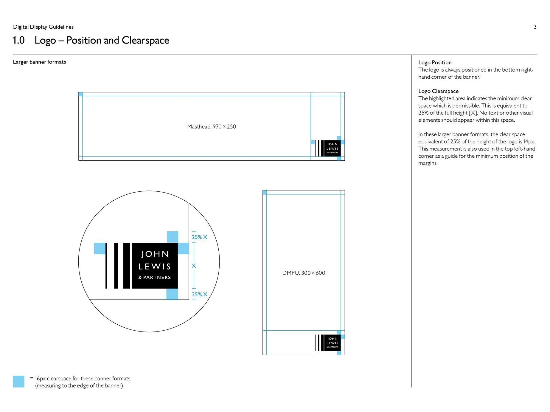
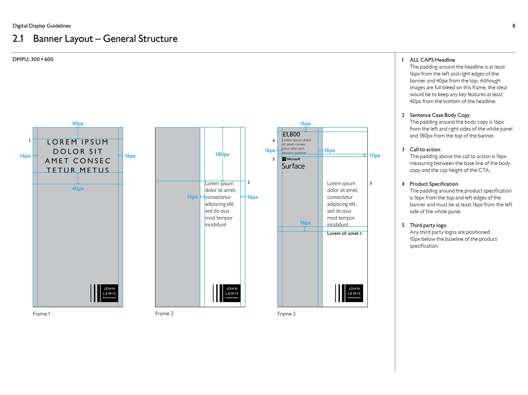
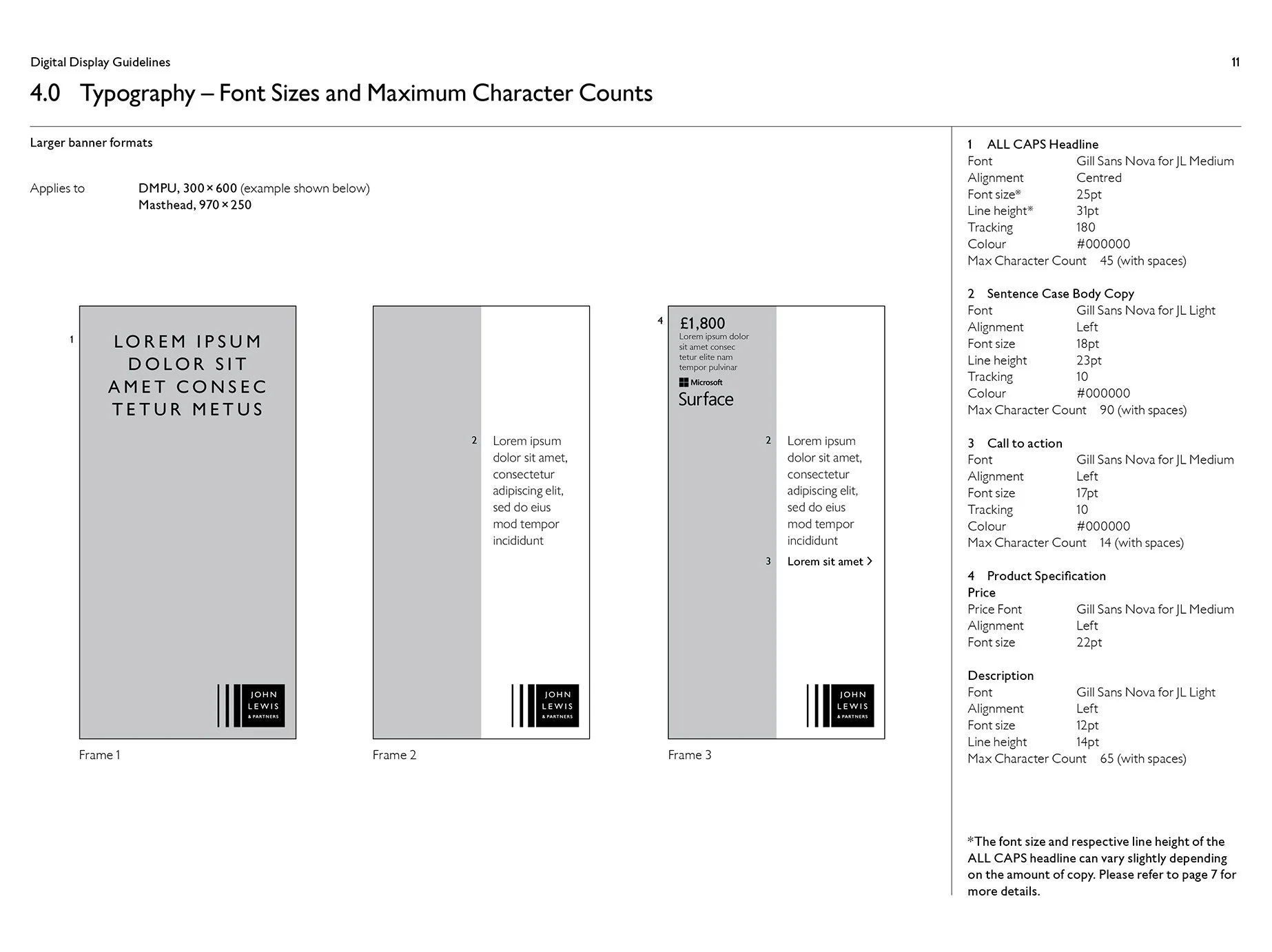
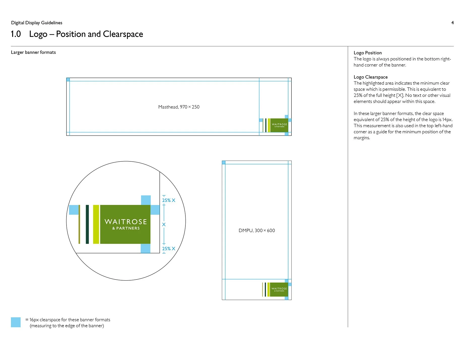
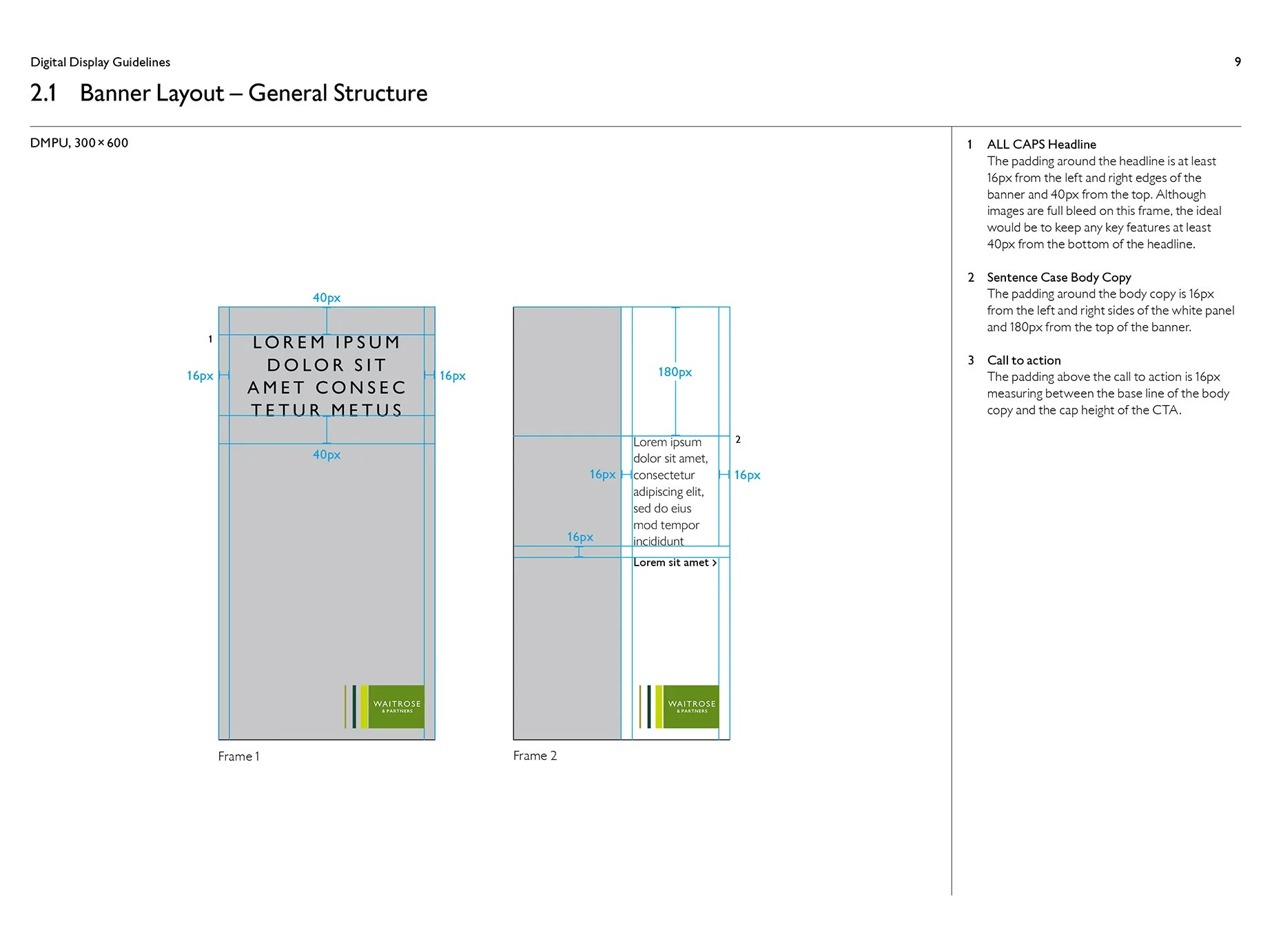
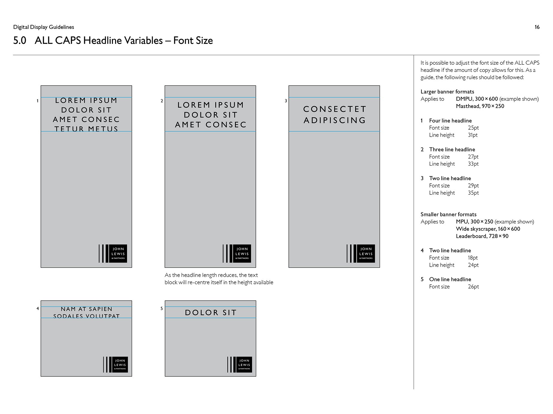
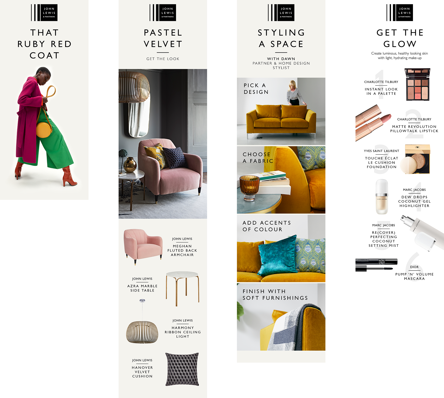
I developed a set of guidelines to ensure visual and messaging consistency across all digital display formats. This established a clear framework for layout, typography and imagery, making it easier to maintain a cohesive brand presence across different sizes.
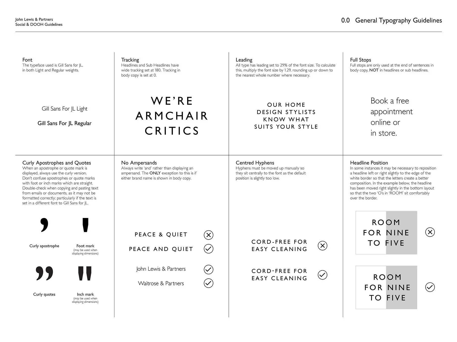
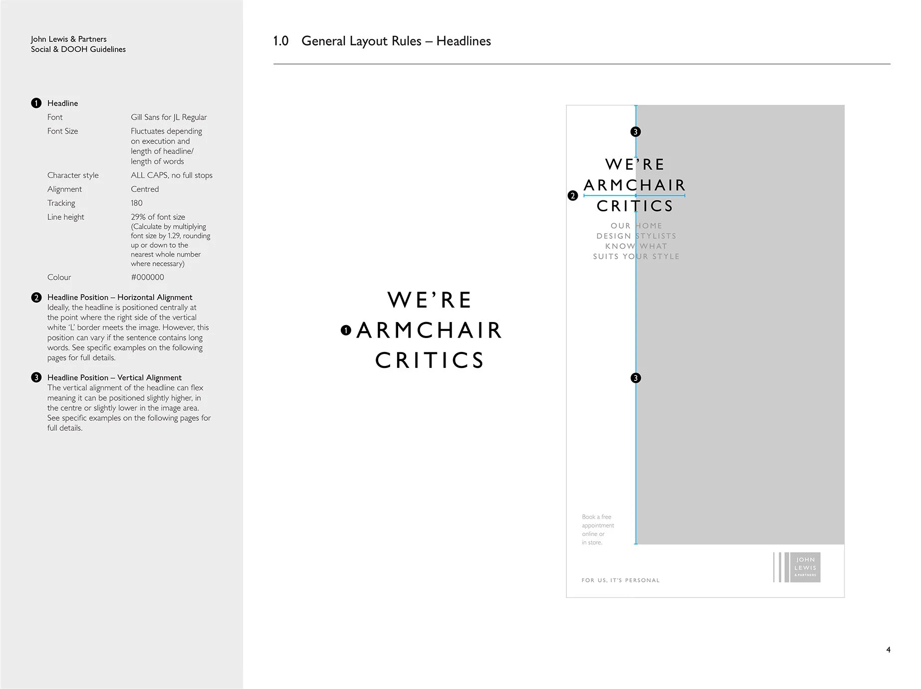
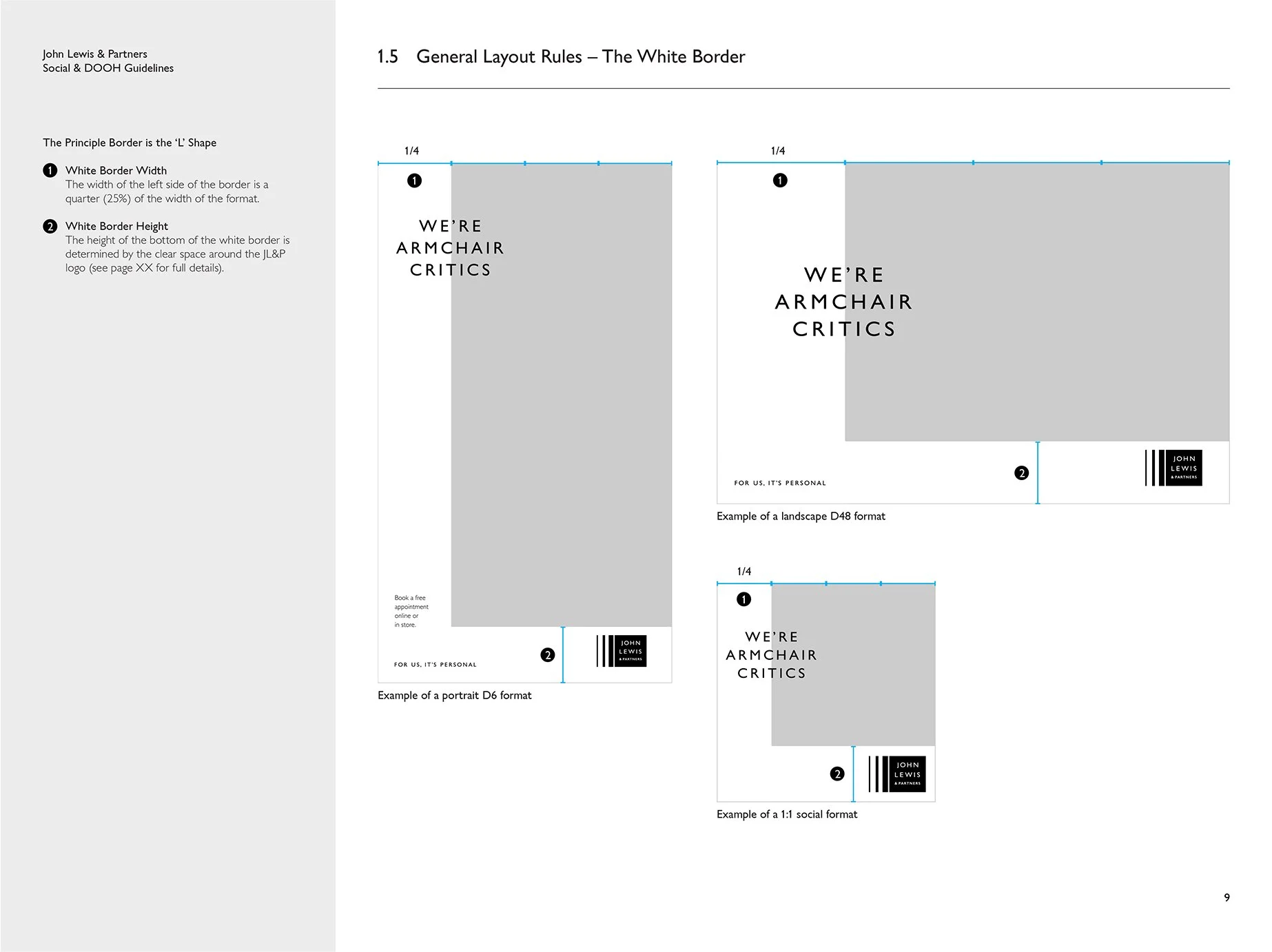
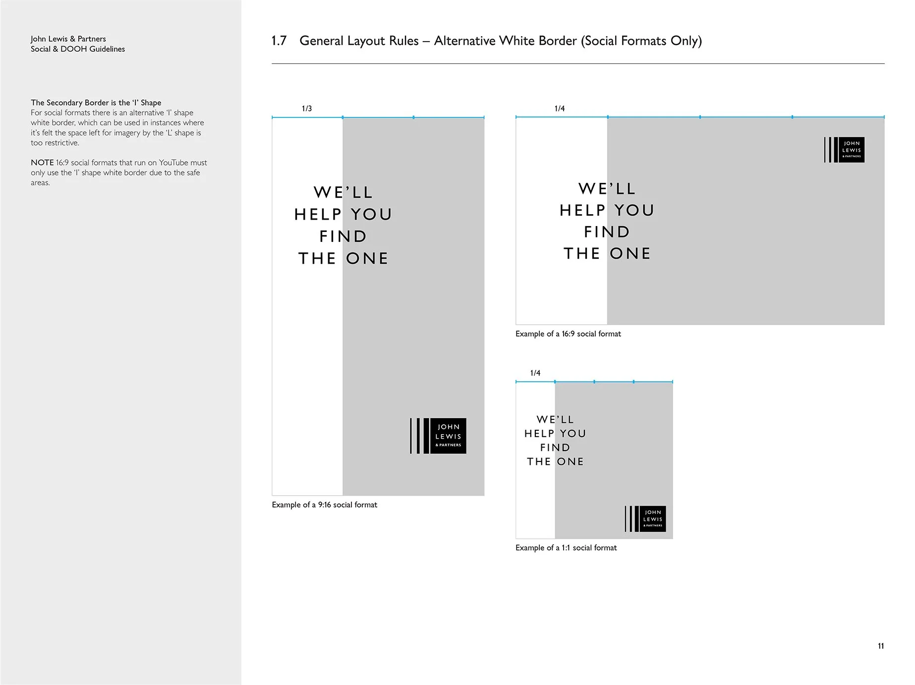
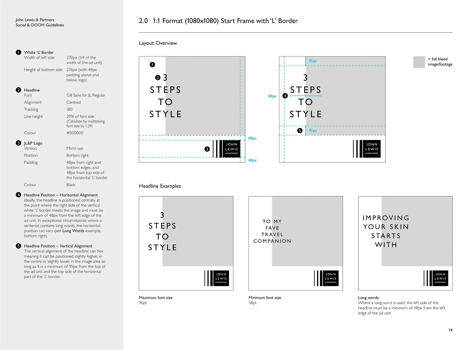
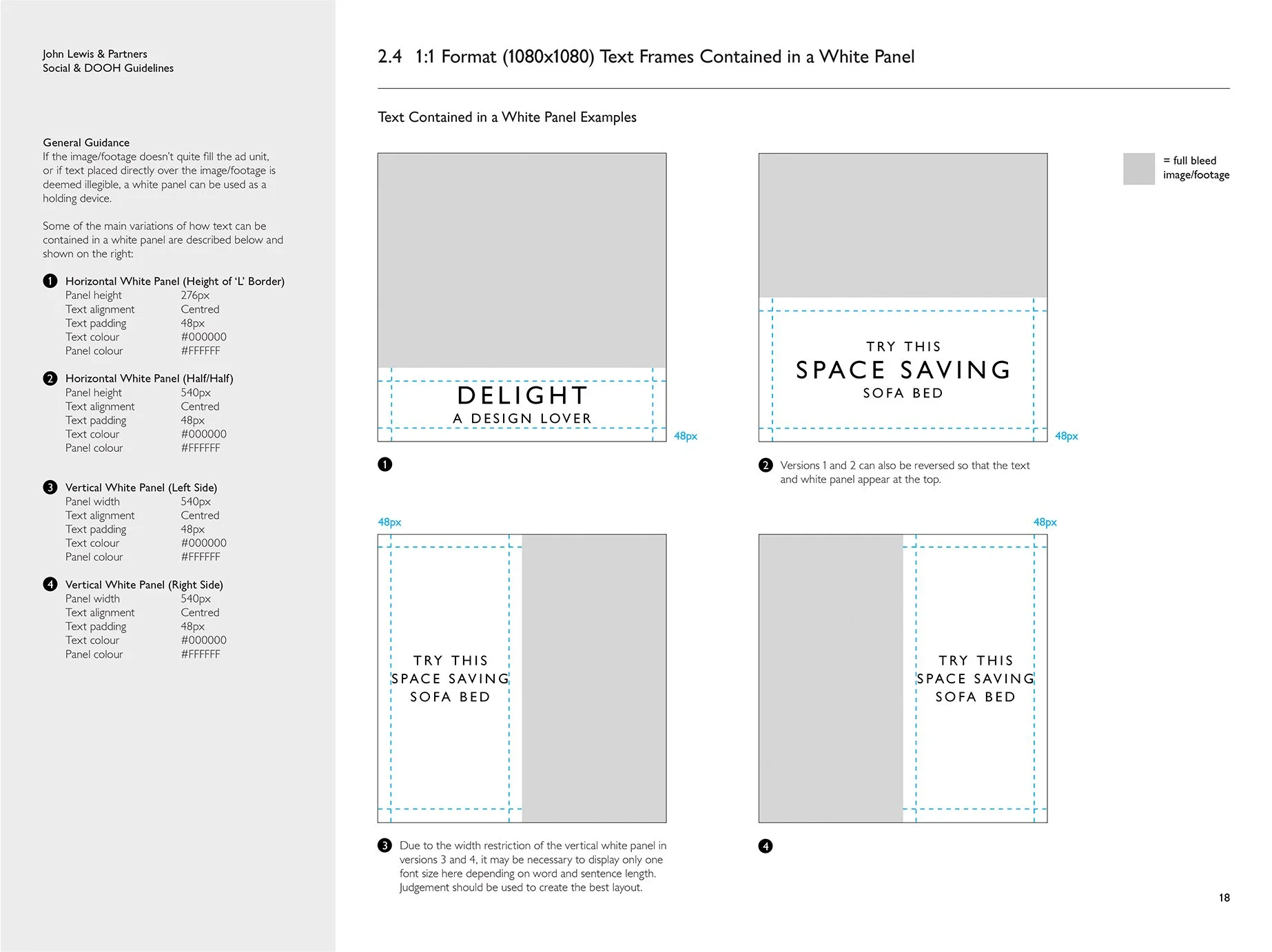
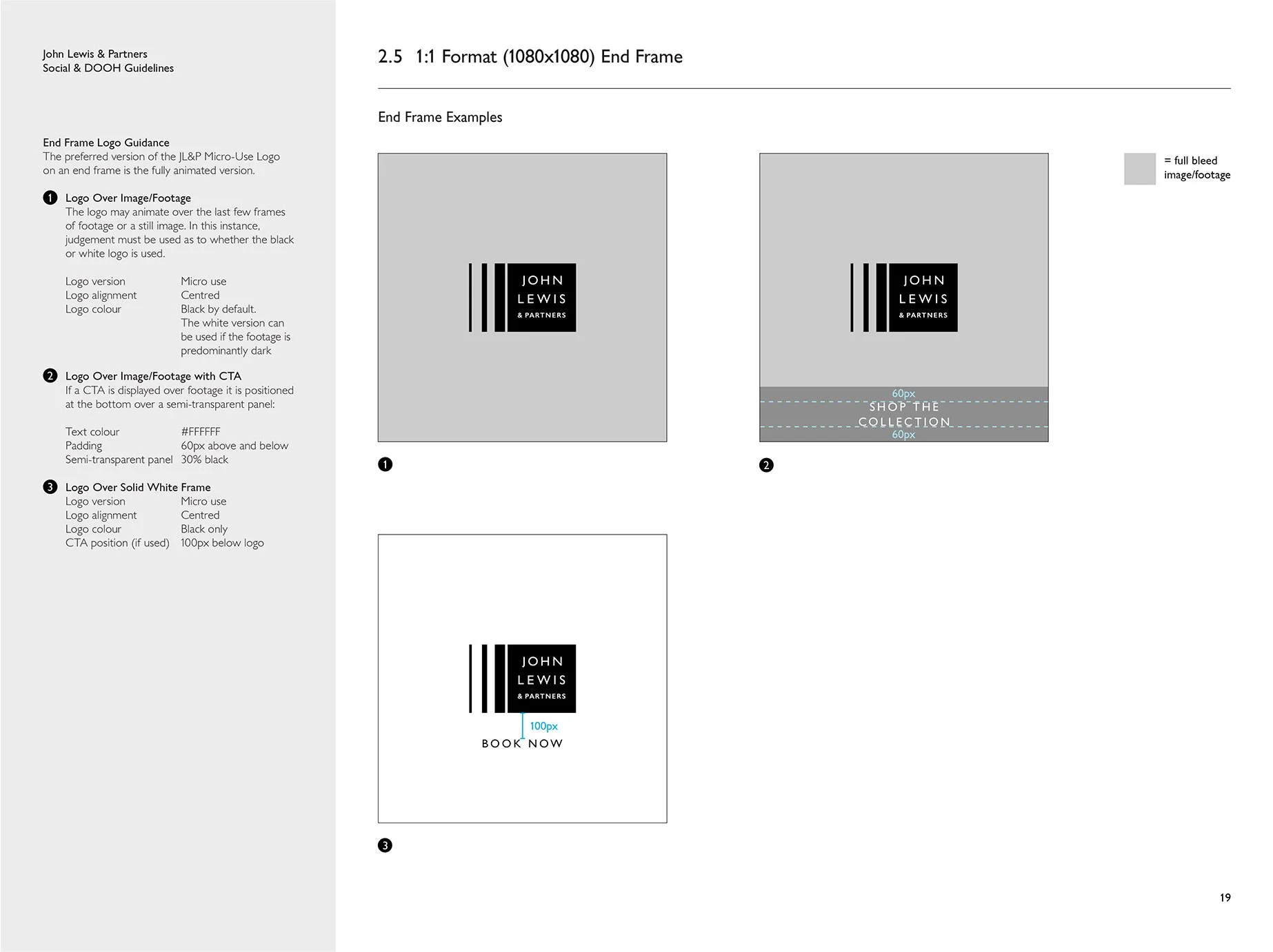
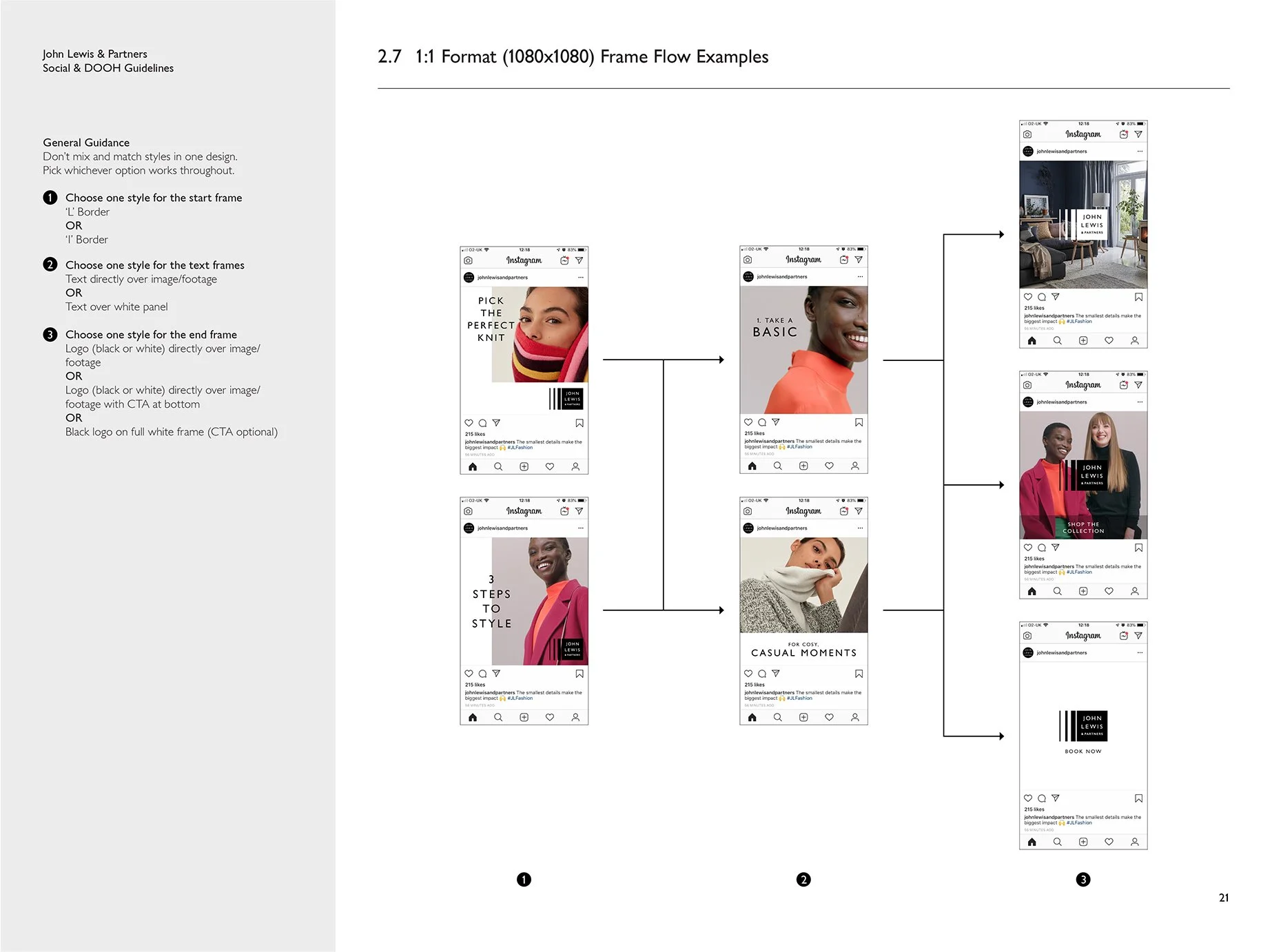
These core guidelines were then adapted into additional principles for building DCO (Dynamic Creative Optimisation) assets for both John Lewis and Waitrose. This allowed for the efficient production of adaptable banners, where images, copy, and other content elements could be quickly updated or swapped out as needed.