Esso
As Digital Design Lead for Esso at adam&eveDDB, I oversaw the digital work across a wide range of campaigns. This included delivering work in multiple languages, reflecting Esso’s presence across much of Europe as well as the UK.
Role: Digital Design Lead
Fuelling Your Friluftsliv
Drawing on the Norwegian concept of friluftsliv — a deep appreciation for life outdoors — I concepted and designed a series of ads positioning Esso as a natural stop on the way to an adventure. Each visual traces a journey from the city to a distinct destination: the beach, a woodland cabin, or the mountains.
At the centre of each execution is a circular illustration that guides the narrative — moving from an urban cityscape, pausing at an Esso petrol station and on to the final destination. Subtle details hint at where the journey is headed from the outset: a canoe, suitcase, or bike mounted on the car signals the beach, cabin, or mountains respectively. The sky’s gradient transitions through the animation to reflect the passage of time, with the beach and mountain journeys unfolding from sunrise to mid-morning, while the cabin route starts at late afternoon and finishes at dusk.
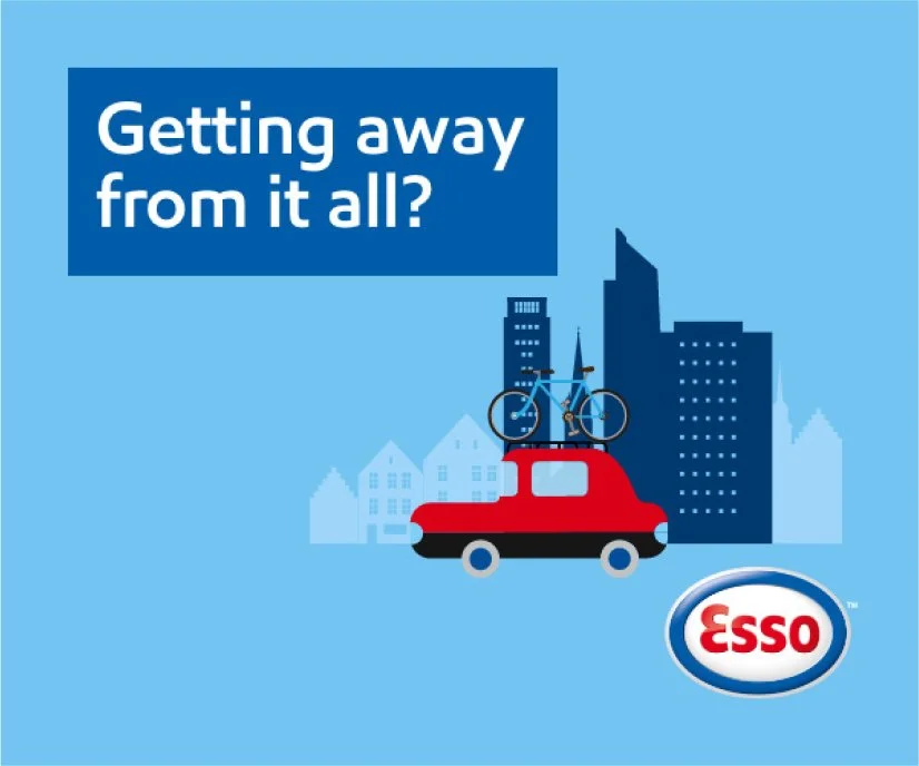
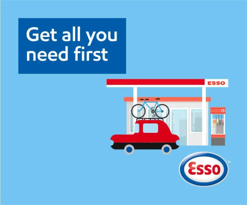
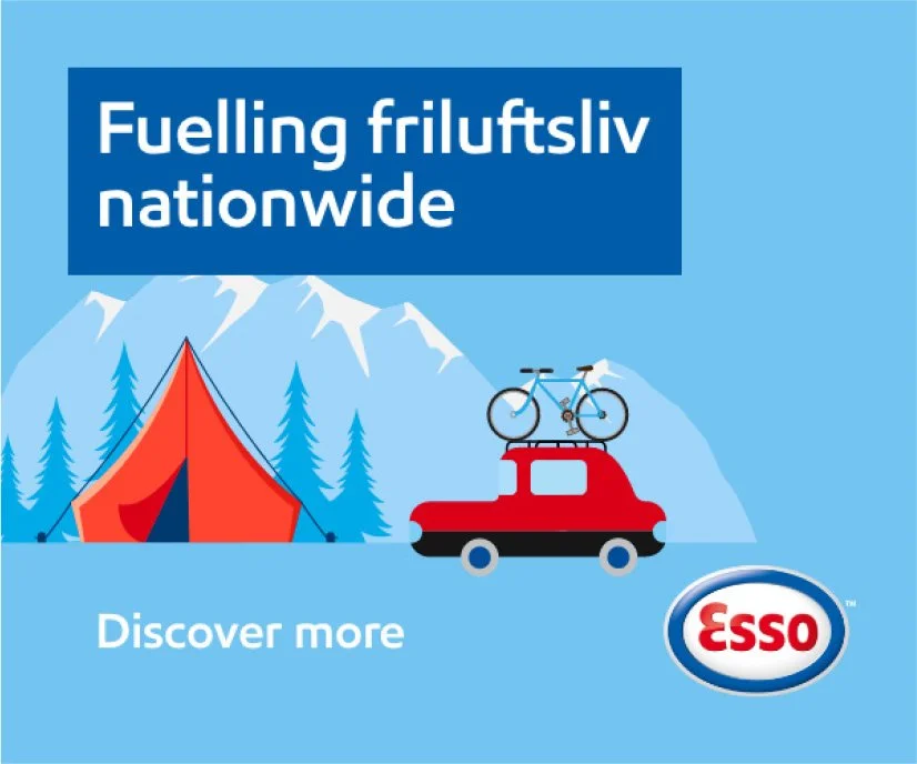
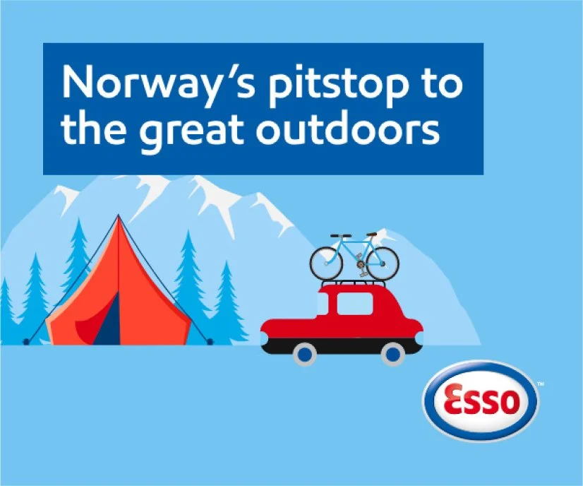
In the early stages of concepting, the landscape remained flat as it moved past the car, creating a simple sense of motion.
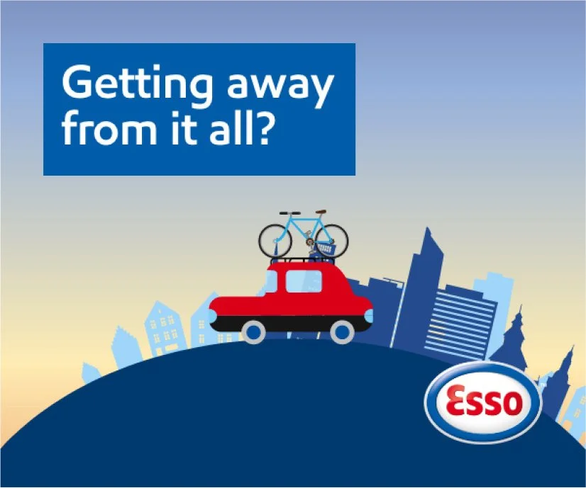
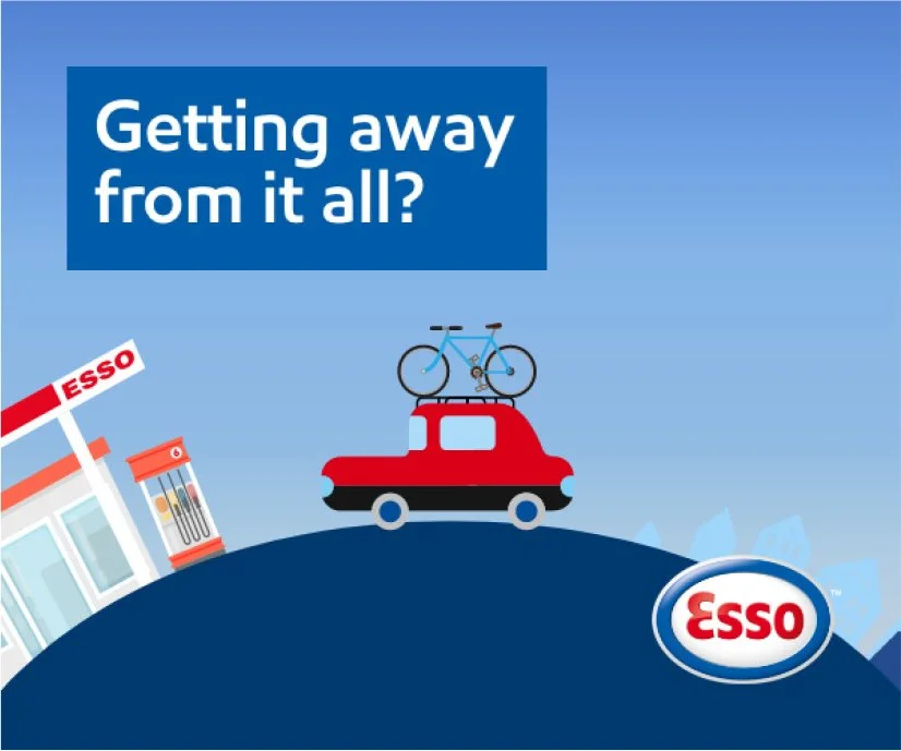
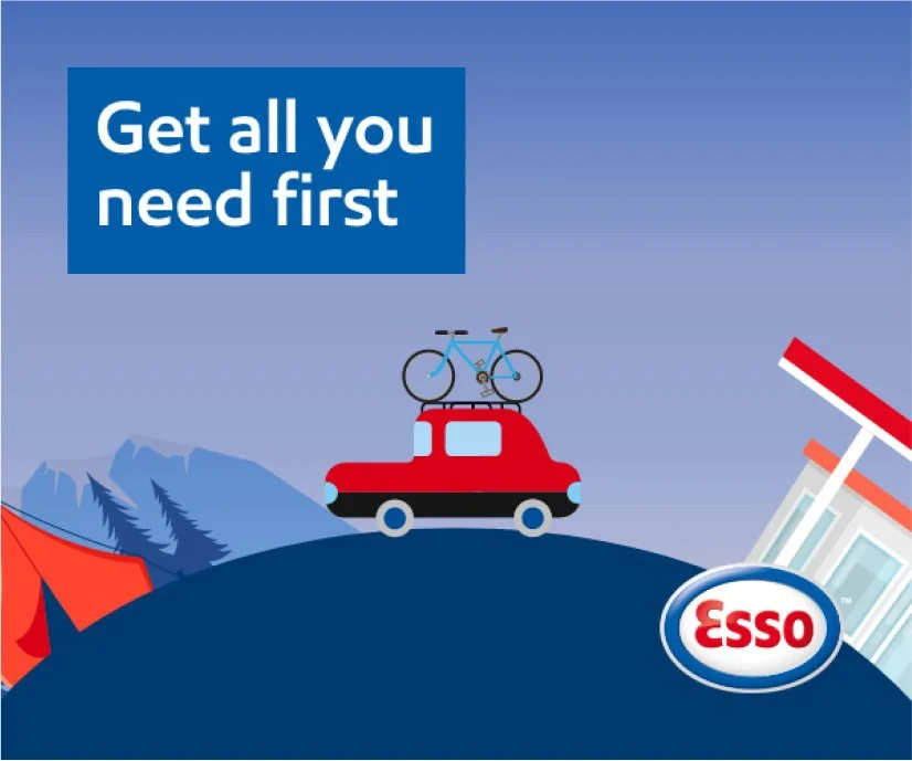
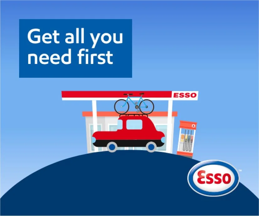
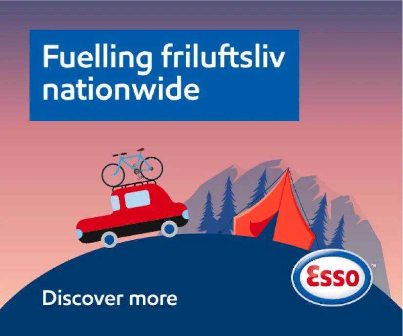
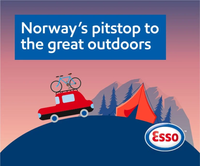
After further refinement, the curved world was introduced along with shifts in the sky’s hue to reflect the time of day. Once the concept was approved, the illustrations were then developed and polished by the official illustrator.
Esso Liftshare
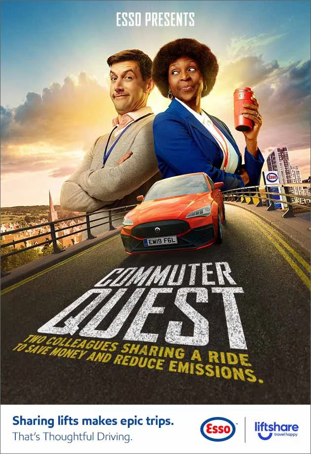
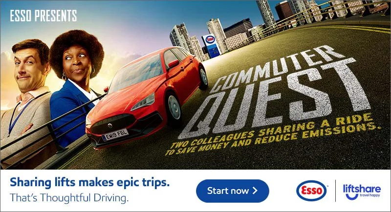
The Esso Liftshare campaign promoted car sharing as an easy way to cut fuel costs while reducing environmental impact. The artwork — adapted from print — borrowed from the language of cinematic film posters, turning an everyday commute into something more dramatic and entertaining. I adapted this to work in each format and collaborated with a developer to introduce animation within the banners, bringing the concept to life and adding an extra layer of visual engagement.

Esso Fuels
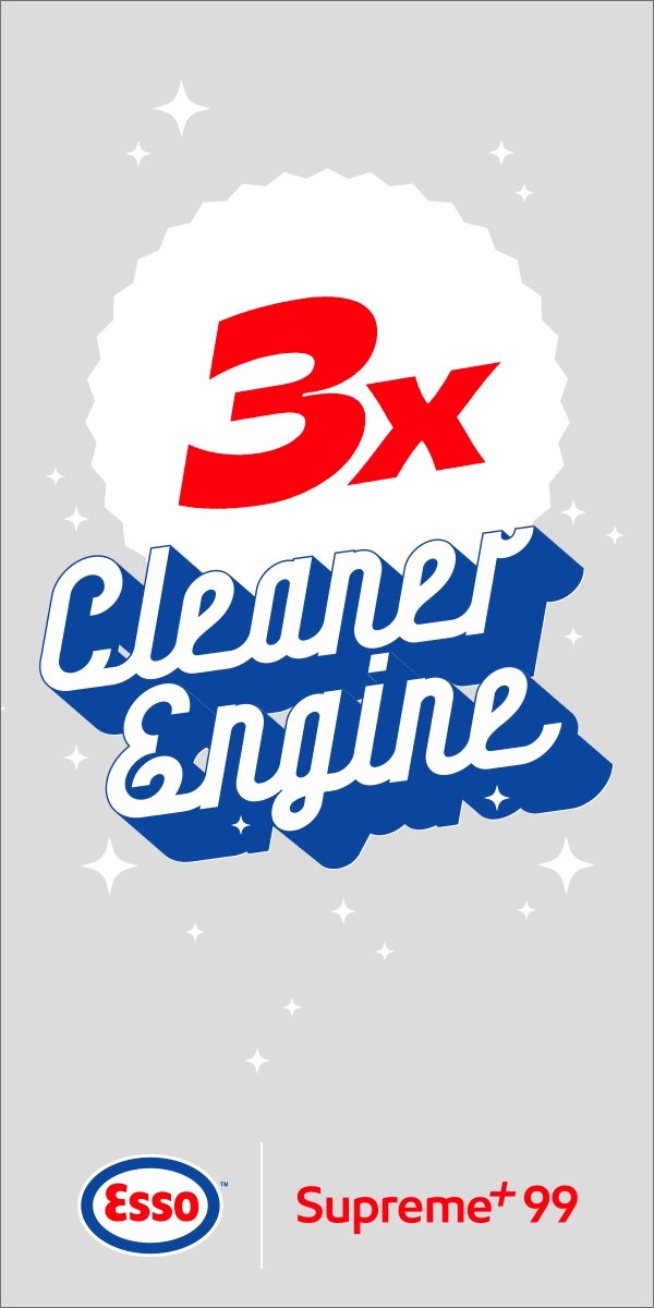
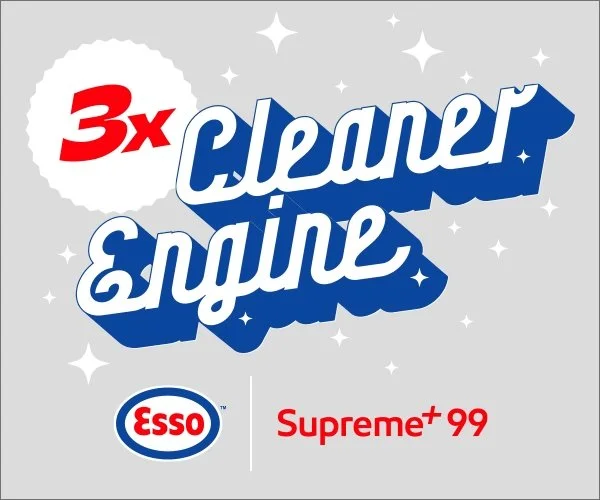
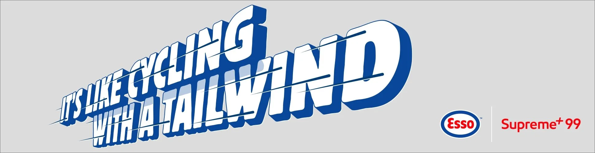
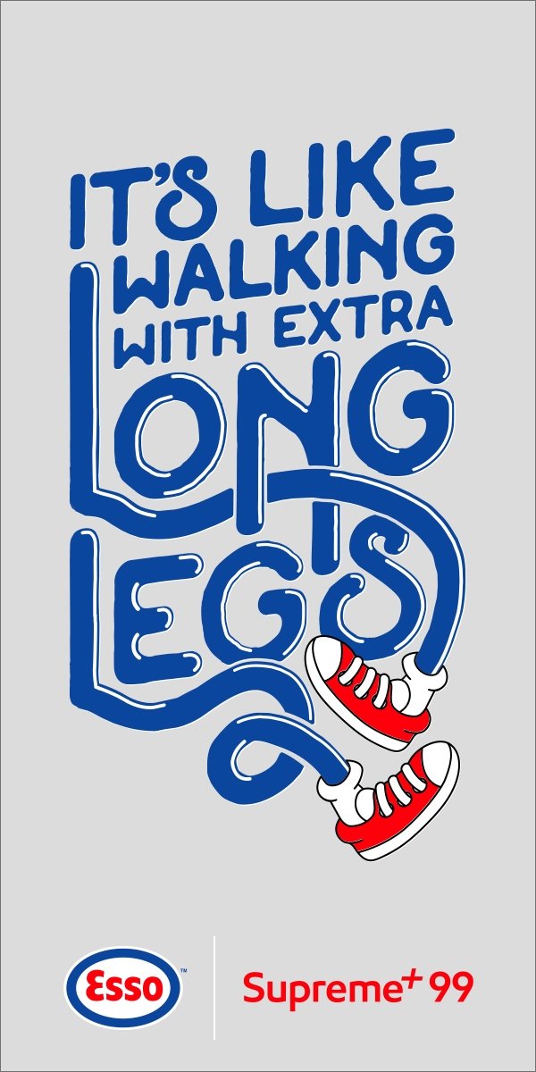
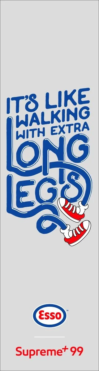
To highlight the benefits of fuelling with Supreme+ 99, each banner focused on a specific feature. Using the original print artwork, I adapted the designs to suit different banner formats — pairing the ‘Long Legs’ creative with skyscraper layouts and ‘Tailwind’ with wider, landscape placements to make the most of each composition. I then collaborated with the developer to introduce animations that reinforced each message, carefully working within banner file size constraints.

Esso Extras
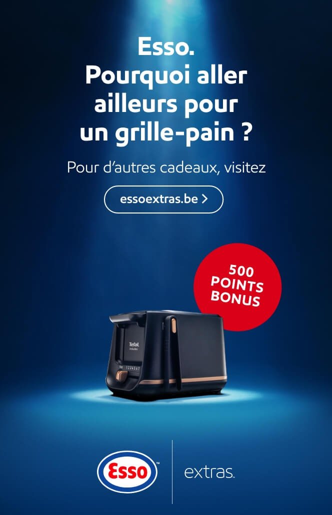
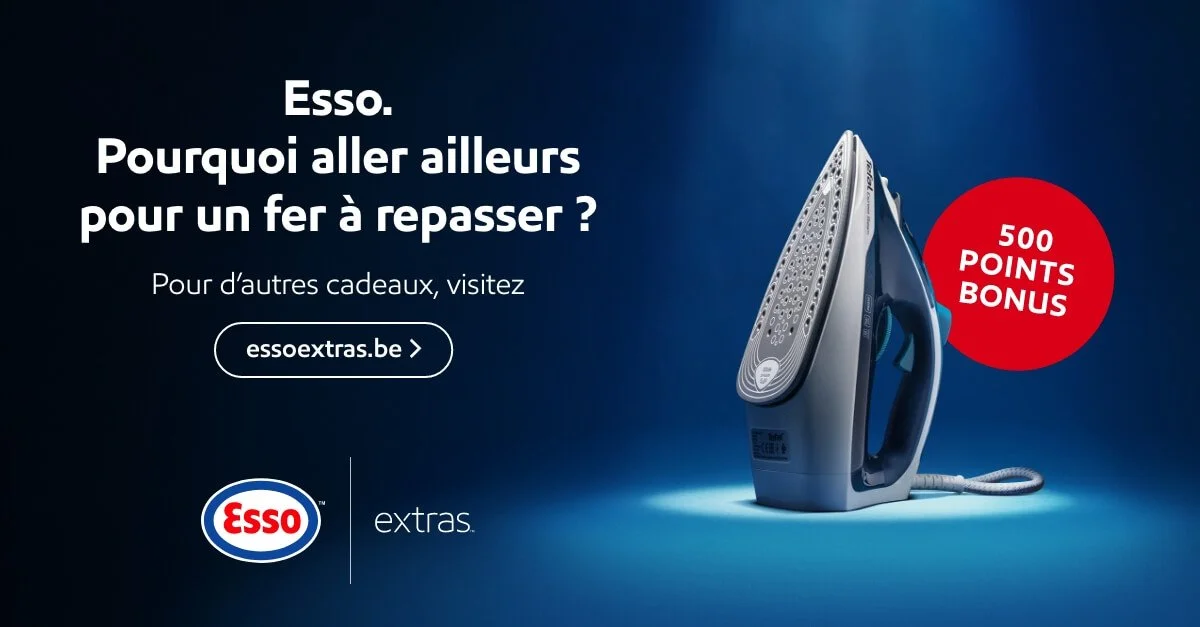
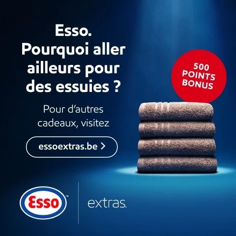
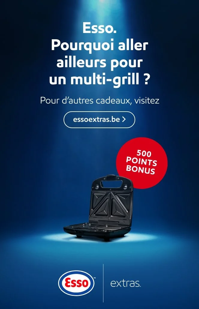
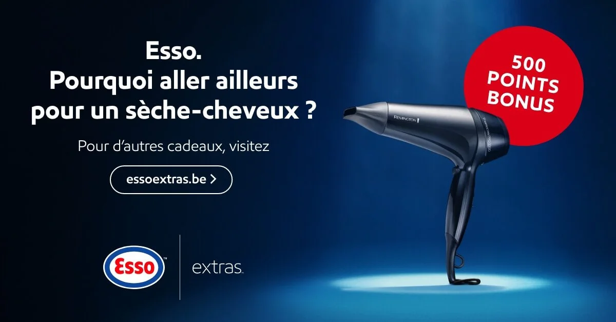
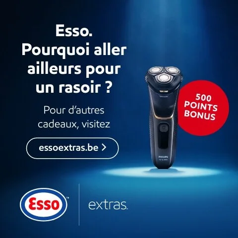
This tongue-in-cheek campaign for ‘Extras’, Esso’s rewards scheme, ran across Belgium in Flemish, Belgian French, and Dutch. It playfully asked, “Why go anywhere else for a (toaster / iron / razor / etc.)?” — highlighting how customers could earn points with every fill-up at Esso and redeem them for these rewards. The set-up was intentionally over the top, using a dramatic spotlight on each gift to elevate these otherwise ordinary items with a sense of premium appeal.
Esso Masterbrand
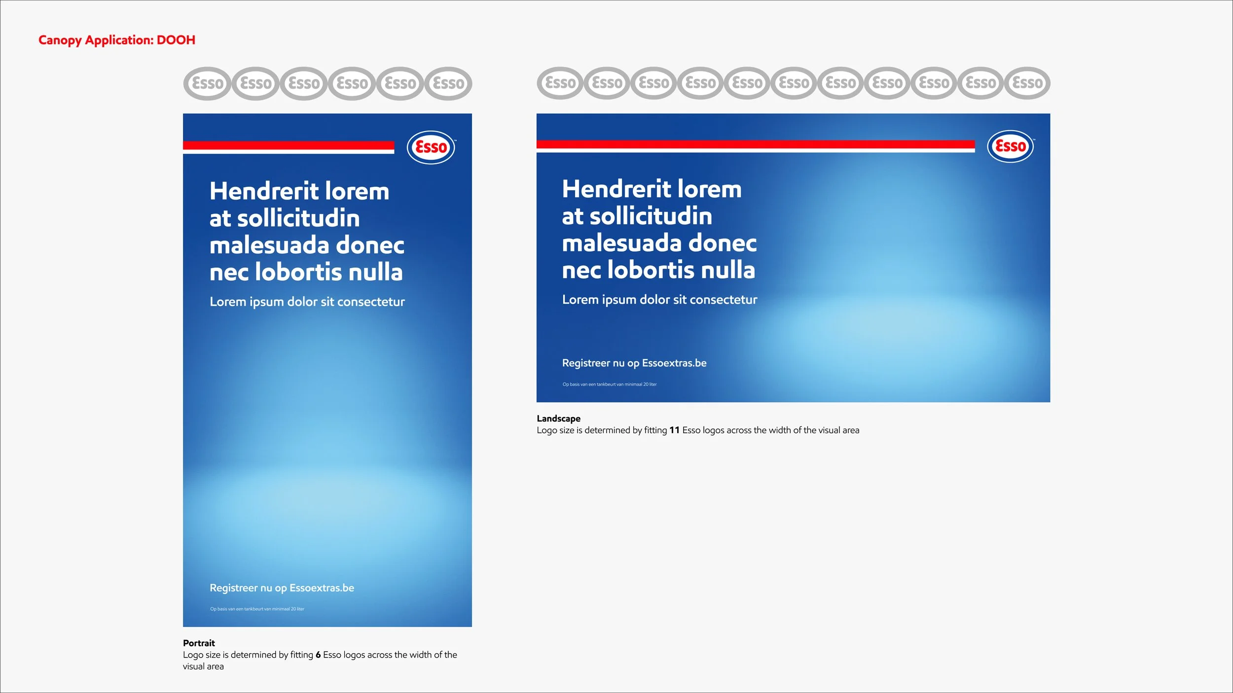
This campaign ran as digital display including banner ads, mobile and desktop skins as well as DOOH formats across the Benelux region (Belgium, the Netherlands and Luxembourg) and was built around the idea that every journey counts. Rather than focusing on fuel, the ads highlight everyday moments of getting around in a world where people often drive less and take shorter trips. From reserving parking to refuelling on the go — or even walking to the shops — Esso can be part of these daily routines.
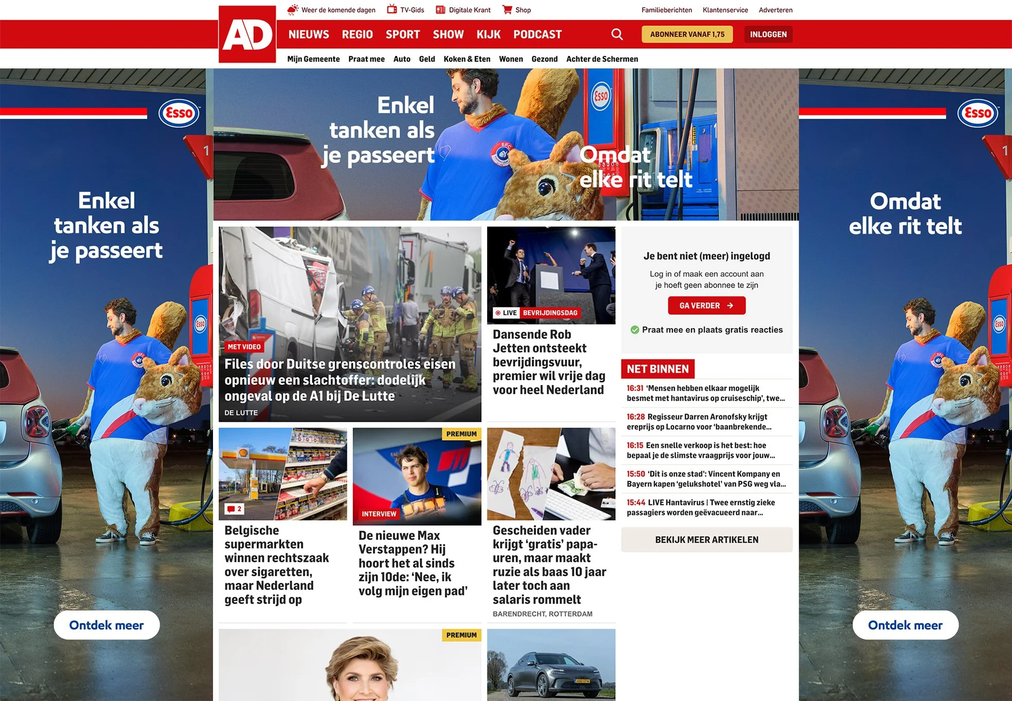
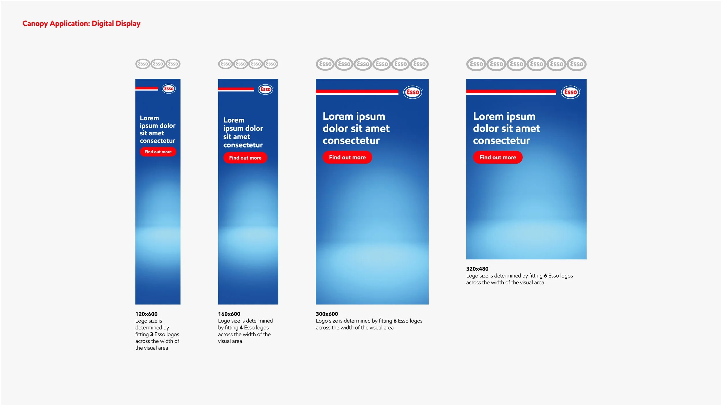
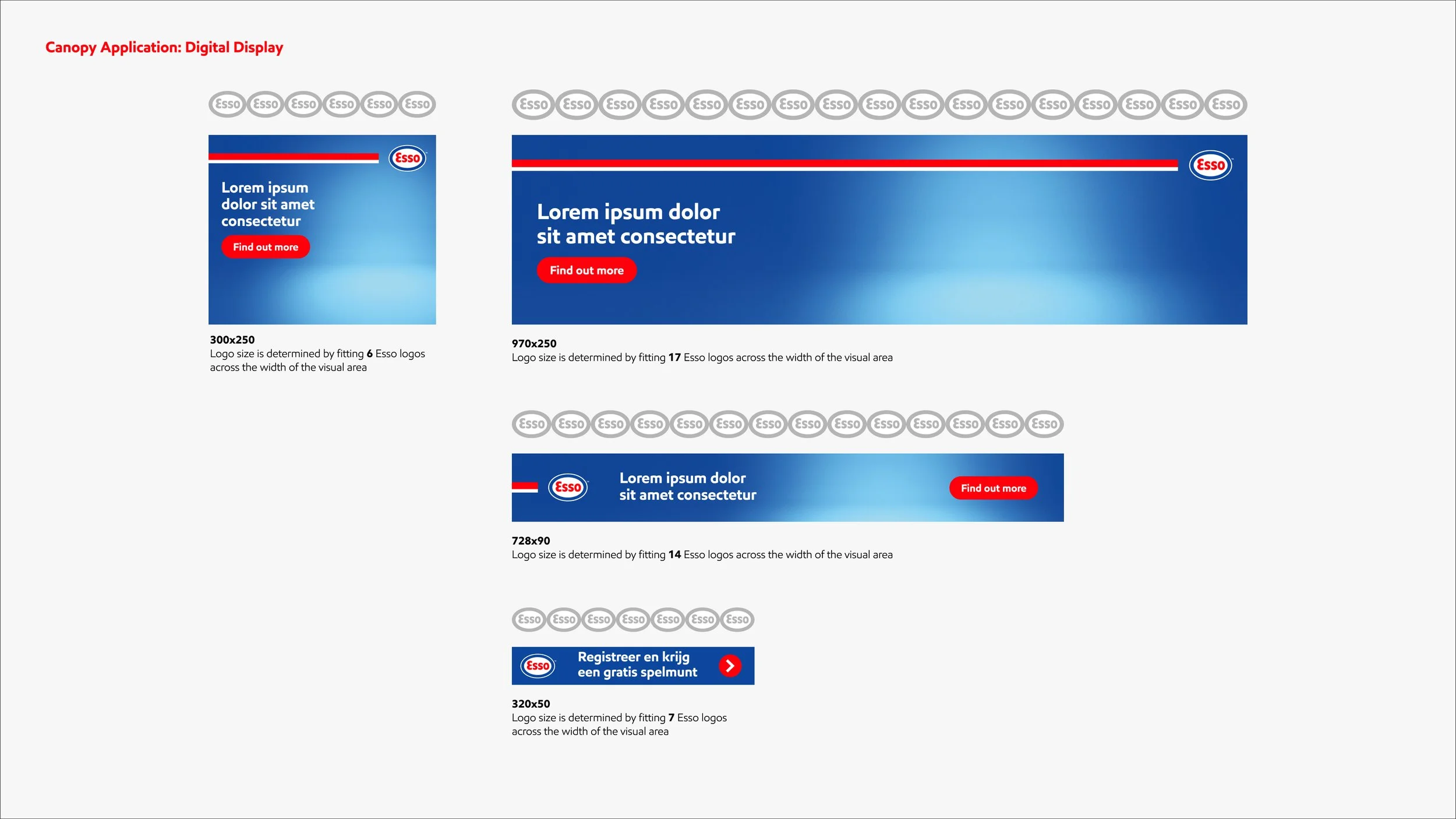
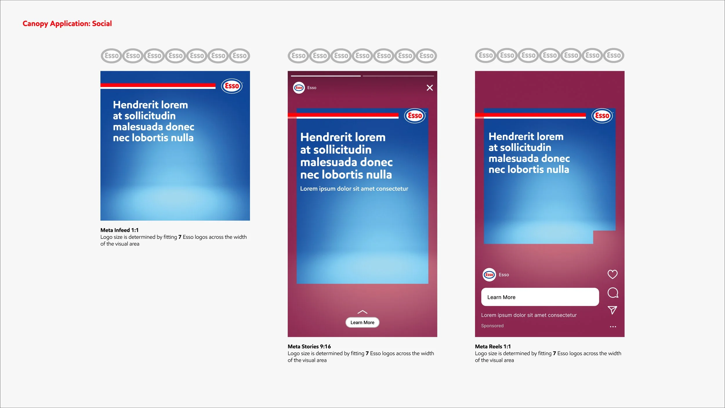
The masterbrand campaign above marked an evolution in the Esso visual identity, repurposing the familiar forecourt canopy stripe (the red and white horizontal bar) as a distinctive graphic device paired with the logo. This approach ensures immediate brand recognition, even in executions where no petrol station or pump is visible. Originally developed by the print team, my role was to translate this device into digital formats and establish clear guidelines for its consistent use.