St. Luke’s Church
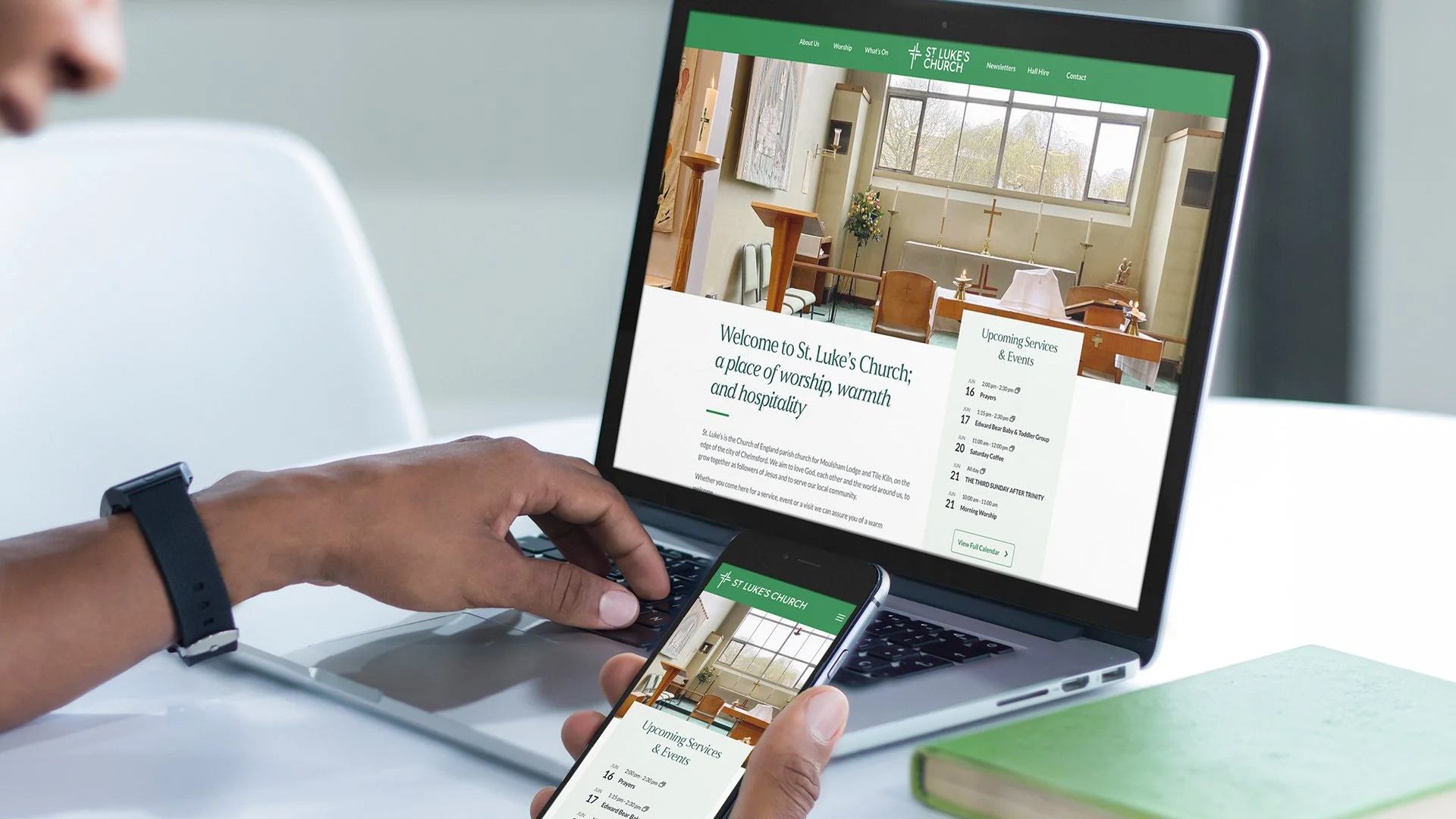
I was approached to create a new identity for St. Luke’s Church, developing a visual system that was applied across a wide range of materials.
Role: Design Lead
The Inspiration
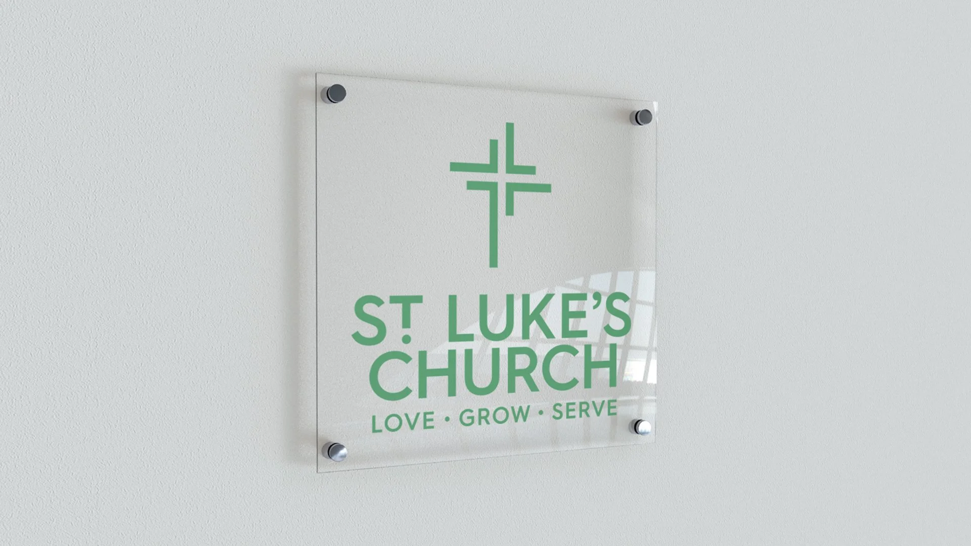
I decided to create a clean, modern logo that combines symbolism and typography into a unified mark. The design features a cross icon created from the same “L” shape used in the name “Luke”. The original “L” is duplicated, rotated 90 degrees counter-clockwise and repeated to create a balanced cross symbol that visually ties the icon directly to the church name.
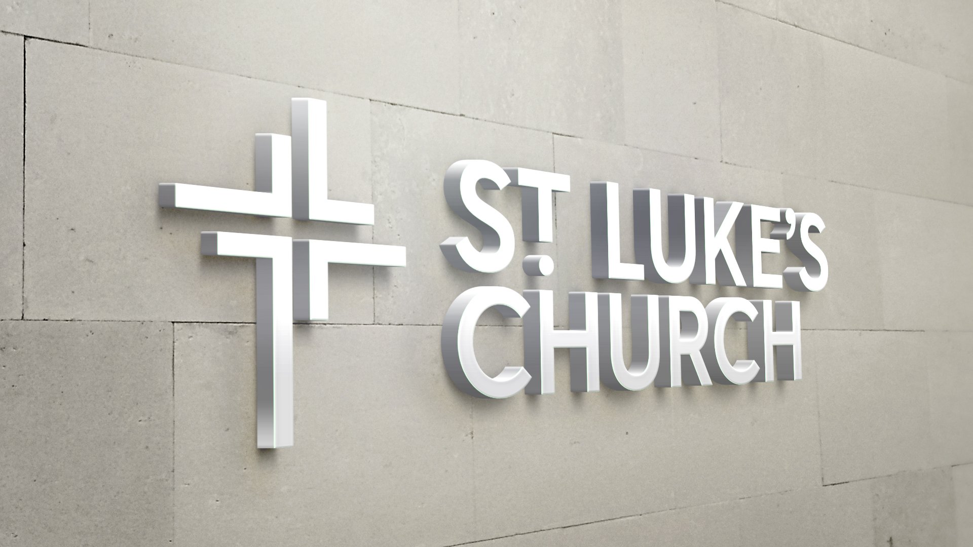
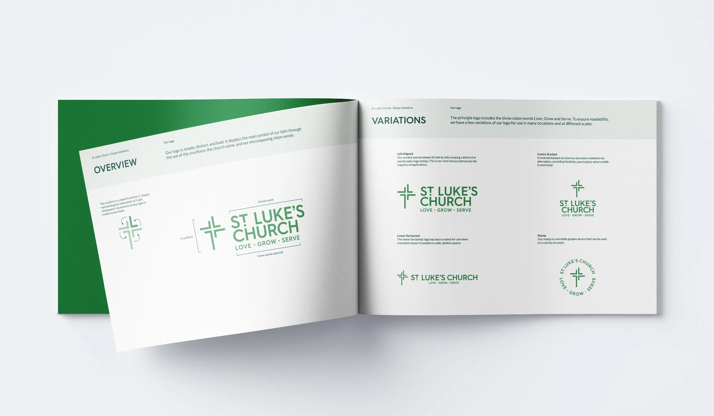
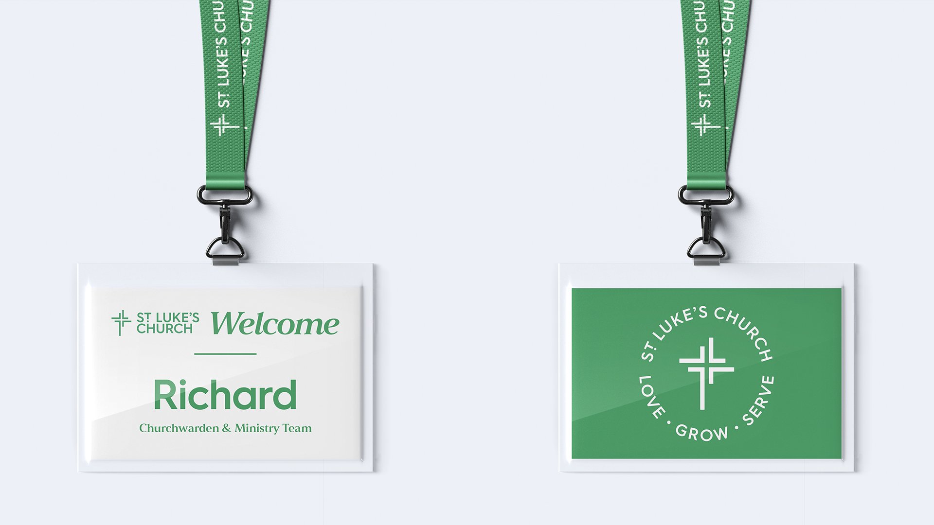
The logo suite includes three primary lockups designed to provide flexibility across a wide range of applications while maintaining a consistent brand identity. This includes a left-aligned logo, a centred stacked version and a streamlined two-line horizontal layout with each version carefully designed to accommodate different formats and space requirements. This flexible approach ensures the logo maintains strong visibility, balance and legibility while preserving a cohesive presence across all platforms.