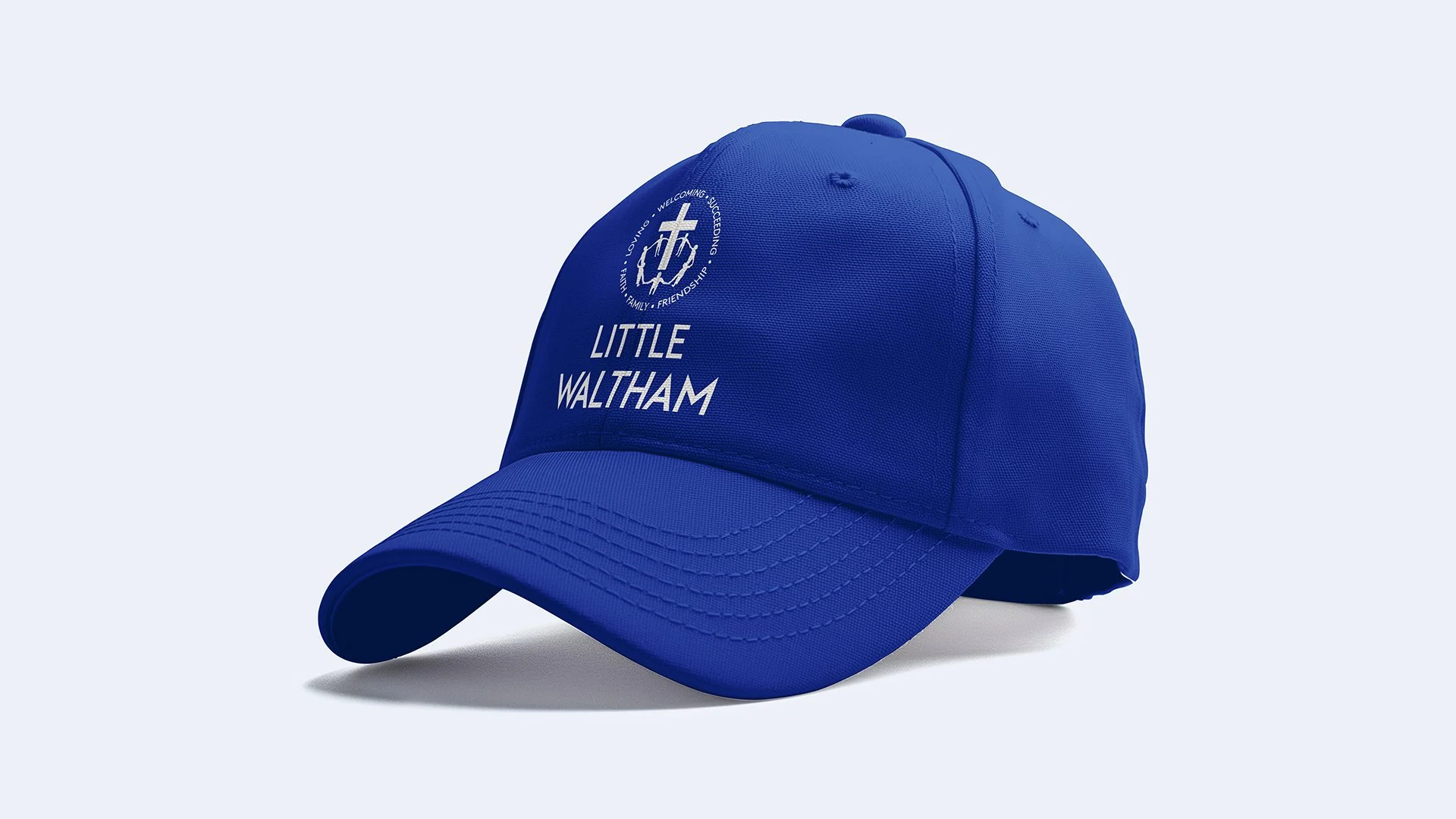
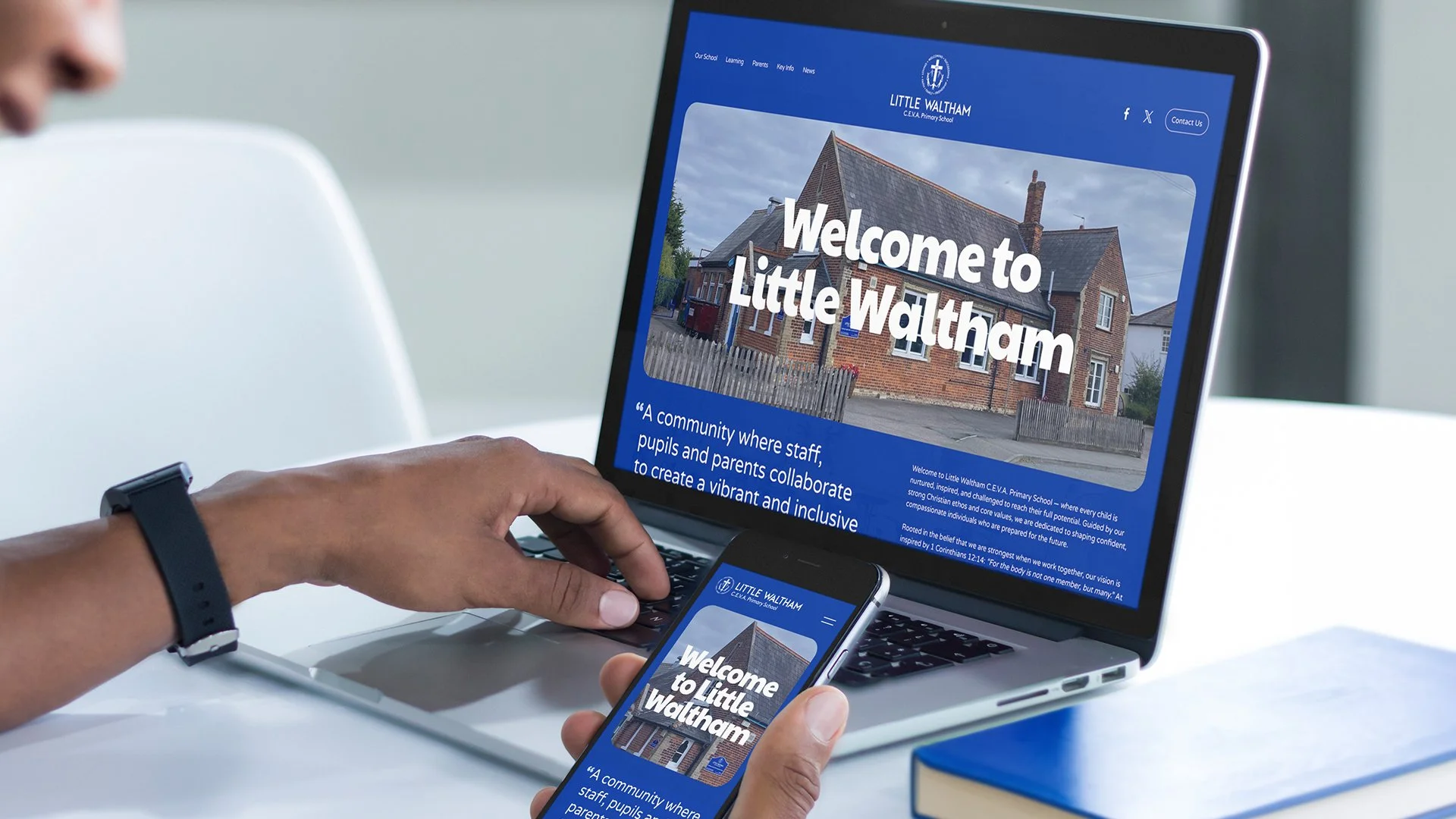
Little Waltham School
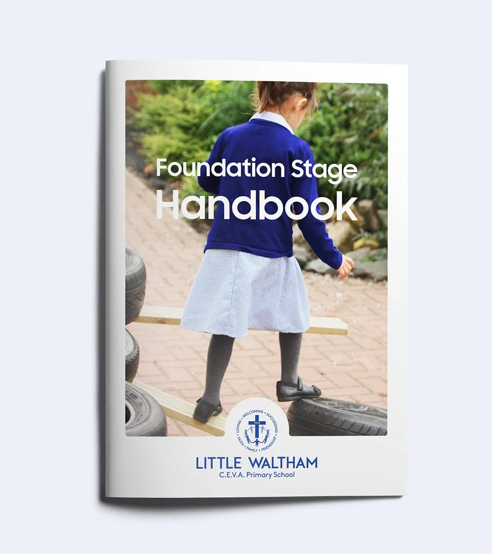
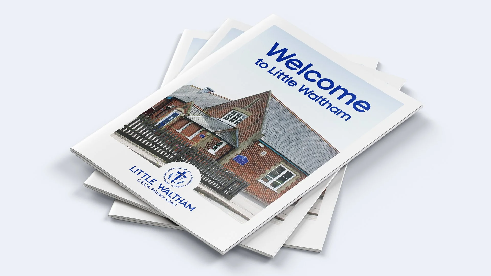
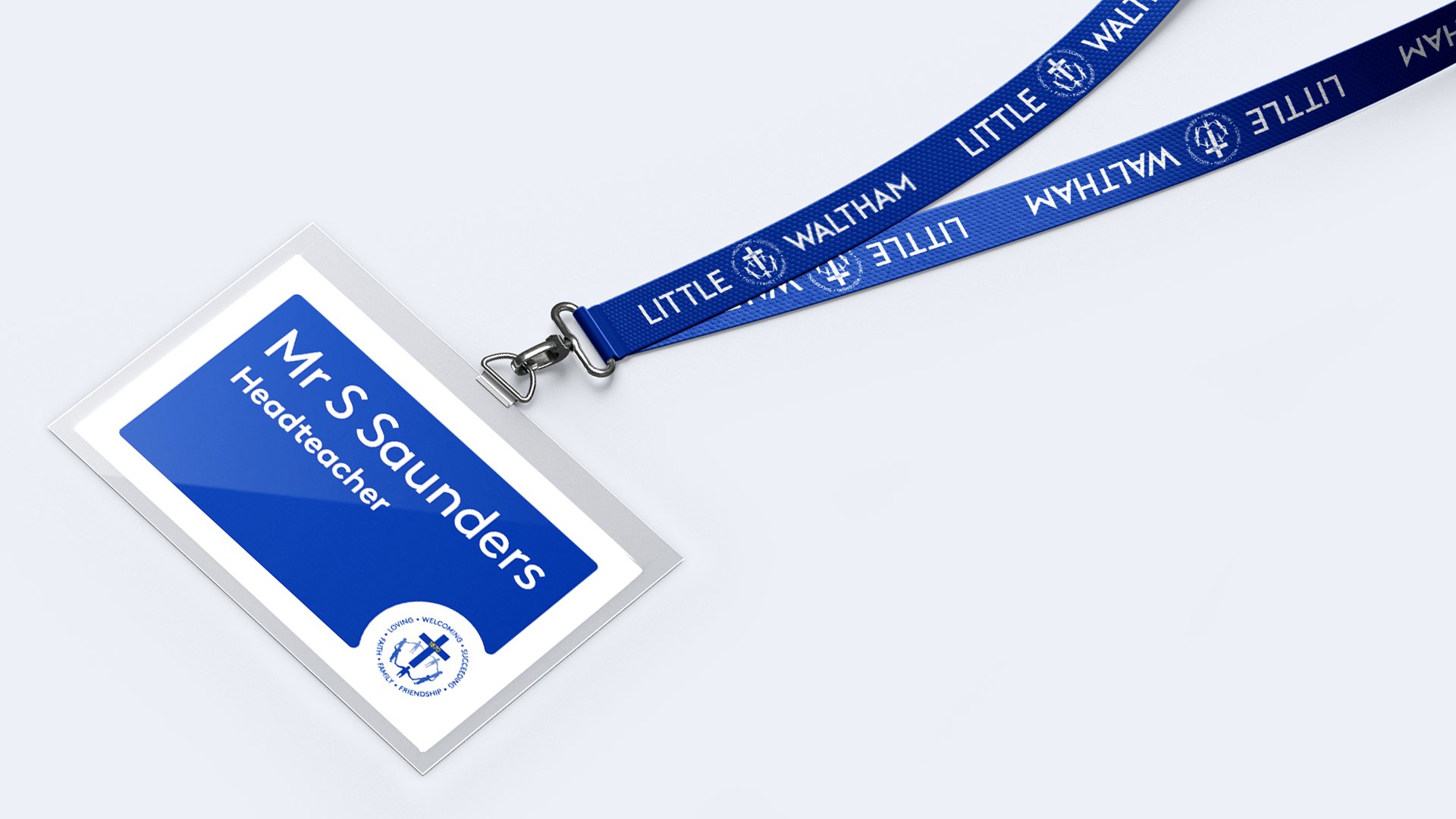
I was tasked with creating the logo for Little Waltham Primary School, developing a new visual identity that was applied across a wide range of materials.
Role: Design Lead
The Inspiration
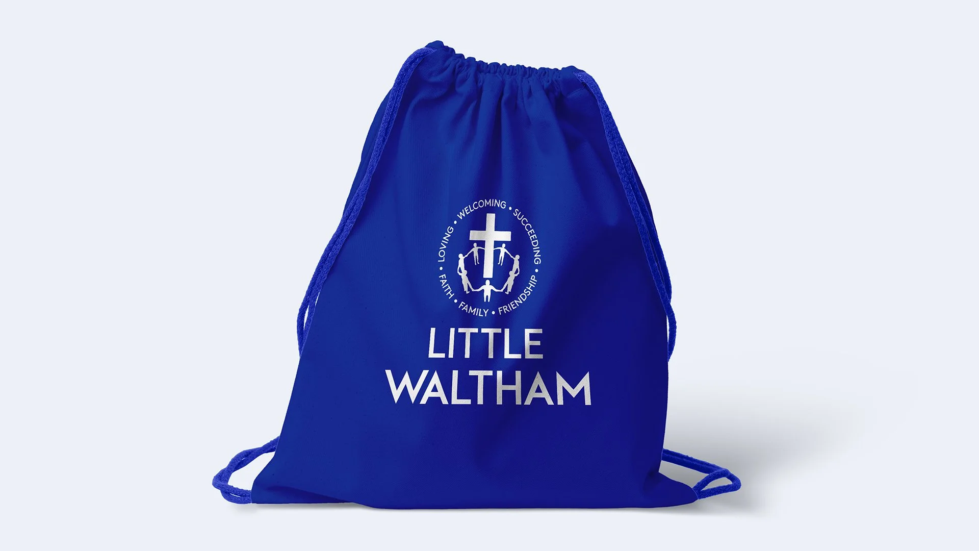
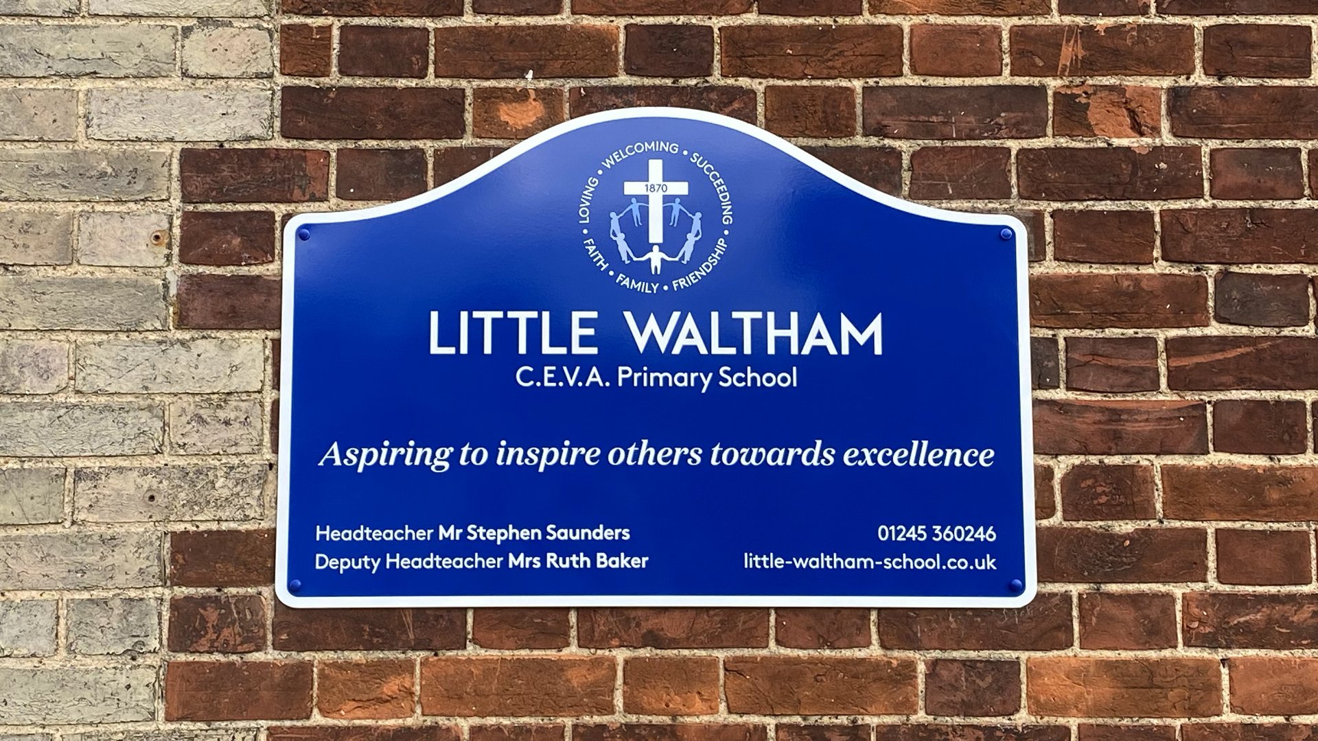
My brief was to reflect the school’s ethos throughout the design. The resulting logo incorporates symbols of faith through the cross, heritage through the inclusion of the school’s founding date and unity through the continuous circle of people. Surrounding the lockup are six key words, chosen by the pupils to represent the school’s vision and values. The colour palette was based on the school’s existing branding, with subtle refinements made to create a more vibrant and contemporary feel.
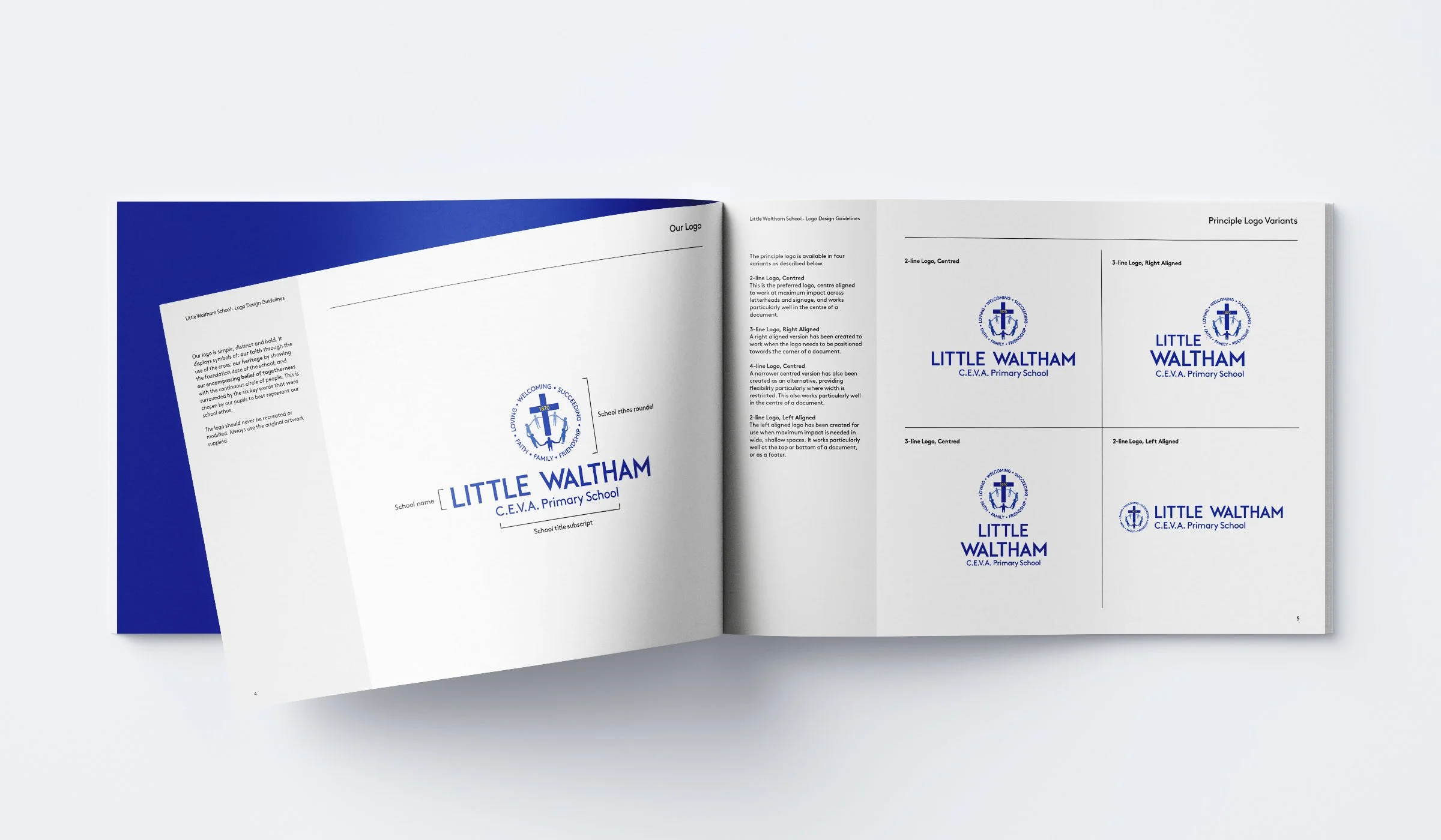
Multiple logo variants were developed to ensure the identity remained clear, consistent, and impactful across a wide range of applications. Different layouts — including centred, right-aligned and horizontal versions — were created to provide flexibility for use in everything from letterheads and signage to website headers and document footers. This approach ensured the logo would always maintain maximum visibility and legibility, regardless of the format, scale, or available space.